内容简介:Effective data visualization is key to the interpretation and communication of data analysis. Ideally a statistical plot or data graphic should balance functionality, interpretability, and complexity, all without needlessly sacrificing aesthetics. That is
Introduction {#d7963e277}
Effective data visualization is key to the interpretation and communication of data analysis. Ideally a statistical plot or data graphic should balance functionality, interpretability, and complexity, all without needlessly sacrificing aesthetics. That is to say, the perfect visualization is one which uses as little 'ink' as possible to capture exactly the desired statistical inference in an intuitive and appealing format (
有效的数据可视化是数据分析的解释和沟通的关键。理想情况下,统计图或数据图应平衡功能,可解释性和复杂性,所有这些都不会不必要地牺牲美学。也就是说,完美的可视化是一种尽可能少的"墨水",以直观和吸引人的格式准确捕捉所需的统计推断(). As concerns regarding the need for robust, reproducible data science have grown in recent years, so too have calls for more meaningful approaches to plotting one's data. Here we present an open source, multi-platform tutorial for the
)。由于近年来对于需要强大,可重复的数据科学的需求日益增长,因此也需要更有意义的方法来绘制一个人的数据。在这里,我们提供了一个开源的,多平台的教程 raincloud plot (
(Neuroconscience, 2018a).{#d7963e280}
).{#d7963e280}
A common visualization method of raw datapoints is the barplot (see
原始数据点的常见可视化方法是条形图(参见, left panel) to represent the mean or median of some condition or group via horizontal bars (or lines) and represents uncertainty about the illustrated parameter estimated via 'whisker' errorbars, usually conveying the standard error or 95% confidence interval. This approach has been widely criticized on several counts, including: 1) it is prone to distortion (e.g., by cropping of the Y-axis), 2) it fails to represent the actual data underlying relevant parameter inferences, 3) it often leads to misleading inferences about the magnitudes of statistical differences between conditions (
,左图)通过水平条(或线)表示某些条件或组的平均值或中值,并表示通过'whisker'错误条估计的所示参数的不确定性,通常传达标准误差或95%置信区间。这种方法在几个方面受到广泛批评,包括:1)它容易失真(例如,通过裁剪Y轴),2)它无法代表相关参数推断的实际数据,3)它经常导致关于条件之间统计差异的大小的误导性推论( Weissgerber et al ., 2015 ) and 4) it may obscure differences in distributions (and concurrent violations of distributional assumptions in parametric statistics). These limitations are illustrated in
)和4)它可能模糊分布的差异(以及参数统计中的分布式假设的同时违反)。这些限制如图所示, below. Indeed, criticism of this approach has reached such a pitched fervor that a movement to "bar bar plots" (
,下面。事实上,对这种方法的批评已经达到了如此激烈的热情,以至于"酒吧地块"的运动(;
;) has arisen with many signees pledging to request all such plots be changed to something more informative^
已经出现了许多签字者承诺要求所有这些情节被改为更具信息性的东西^^.{#d7963e292} {#f1}
^。{#d7963e292} {#f1}
Figure 1. The trouble with barplots.
Example reproduced from "Boxplots vs. Barplots" (
例子转载自"Boxplots vs. Barplots"() two simulated datasets with mean = 50, sd = 25, and 1000 observations.
)两个模拟数据集,平均值= 50,sd = 25,观察值为1000。 A ) a barplot and errorbars representing +/- standard error of the mean gives the impression that the measure is equivalent between the two groups. In fact, group 1 is drawn from an exponential distribution as seen in
)表示平均值+/-标准误差的条形图和误差条给人的印象是该度量在两组之间是等效的。事实上,第1组是从指数分布中得出的,如图所示 B ) boxplots, and
) boxplots, and C ) histograms. The barplot not only obscures the underlying nature of the observations, but also hides the fact that these data are not appropriate for standard parametric inference. See
)直方图。条形图不仅模糊了观察的基本性质,而且隐藏了这些数据不适合标准参数推断的事实。看到 figure1.Rmd {#d7963e342} for code to generate these figures.{#d7963e328}
{#d7963e342}用于生成这些数字的代码。{#d7963e328}
To remedy these shortcomings, a variety of visualisation approaches have been proposed, illustrated in
为了弥补这些缺点,已经提出了各种可视化方法,如图所示, below. One simple improvement is to overlay individual observations (datapoints) beside the standard bar-plot format, typically with some degree of randomized jitter to improve visibility (
,下面。一个简单的改进是在标准条形图格式旁边叠加单个观察(数据点),通常具有一定程度的随机抖动以提高可见性(). Complementary to this approach, others have advocated for more statistically robust illustrations such as boxplots (
)。对这种方法的补充,其他人则提倡更具统计学性的插图,如箱形图(), which display sample median alongside interquartile range. Dot plots can be used to combine a histogram-like display of distribution with individual data observations (
),显示样本中位数和四分位数范围。点图可用于将类似直方图的分布显示与单个数据观察结合起来(). In many cases, particularly when parametric statistics are used, it is desirable to plot the distribution of observations. This can reveal valuable information about how e.g., some condition may increase the skewness or overall shape of a distribution. In this case, the 'violin plot' (
)。在许多情况下,特别是在使用参数统计时,需要绘制观测的分布。这可以揭示关于例如某些条件可能如何增加分布的偏度或整体形状的有价值信息。在这种情况下,'小提琴情节'() which displays a probability density function of the data mirrored about the uninformative axis is often preferred (
)显示关于无信息轴镜像的数据的概率密度函数通常是优选的(Hintze & Nelson, 1998). With the advent of increasingly flexible and modular plotting tools such as ggplot2 (
)。随着越来越灵活和模块化的绘图 工具 的出现,如ggplot2(;
;Wickham & Chang, 2008), all of the aforementioned techniques can be combined in a complementary fashion.{#d7963e350} {#f2}
),所有上述技术都可以互补的方式组合。{#d7963e350} {#f2}
Figure 2. Extant approaches to improved data plotting.
A) The simplest improvement is to add jittered raw data points to the standard boxplot and +/- standard error scheme.
)最简单的改进是将抖动的原始数据点添加到标准箱图和+/-标准错误方案中。 B ) Alternatively, dotplots can be used to supplement visualizations of central tendency and error, at the risk of added complexity due to the dependence of such plots on choices such as bin-width and dot size.
)或者,点图可用于补充集中趋势和误差的可视化,由于这些图对诸如箱宽和点尺寸之类的选择的依赖性而存在增加复杂性的风险。 C ) A popular recent alternative is the violin plot coupled with boxplots or similar. However, this needlessly mirrors information about the redundant data axis (here, the x-axis). See
最近流行的另一种选择是小提琴情节与箱形图或类似情节相结合。然而,这不必要地反映了关于冗余数据轴(这里是x轴)的信息。看到 figure2.Rmd {#d7963e399} for code to generate these figures.{#d7963e389}
{#d7963e399}代码生成这些数字。{#d7963e389}
Indeed, this combined approach is typically desirable as each of these visualization techniques have various trade-offs. Simply plotting raw data can reveal valuable information about individual differences, outliers, and unexpected patterns within the data. However, human observers are notoriously poor^
实际上,这种组合方法通常是期望的,因为这些可视化技术中的每一种都具有各种权衡。简单地绘制原始数据可以揭示有关数据中个体差异,异常值和意外模式的有价值信息。然而,人类观察者是出了名的穷人^^ at estimating statistical moments and distributions from raw data (
^估计原始数据的统计矩和分布(;
;"Guess the Correlation," 2017;
;;
; Zylberberg et al ., 2014 ), and the utility of such plots can be limited when the number of observations is large. In this case the dotplot may be advantageous, as it displays both a histogram of raw data points and the frequency of different binned observations. On the other hand, the interpretation of dotplots depends heavily on the choice of dot-bin and dot-size, and these plots can also become extremely difficult to read when there are many observations. The violin plot in which the probability density function (PDF) of observations are mirrored, combined with overlaid boxplots, have recently become a popular alternative. This provides both an assessment of the data distribution and statistical inference at a glance (SIG) via overlaid boxplots^
当观察数量很大时,可以限制这些图的效用。在这种情况下,点图可能是有利的,因为它显示原始数据点的直方图和不同的分箱观察的频率。另一方面,点图的解释在很大程度上取决于点框和点尺寸的选择,当有许多观察时,这些图也可能变得非常难以阅读。最近,观察到概率密度函数(PDF)的观察结果与叠加的箱形图相结合的小提琴图最近成为一种流行的选择。这通过覆盖的箱线图提供了对数据分布和统计推断的一瞥(SIG)的评估^. However, there is nothing to be gained, statistically speaking, by mirroring the PDF in the violin plot, and therefore they are violating the philosophy of minimising the "data-ink ratio" (
^。然而,从统计学上讲,通过在小提琴情节中反映PDF,没有任何东西可以获得,因此它们违反了最小化"数据墨水比"的理念()^
)^^.{#d7963e407}
^.{#d7963e407}
To overcome these issues, we propose the use of the 'raincloud plot' (
为了克服这些问题,我们建议使用'raincloud plot'(Neuroconscience, 2018a), illustrated in
), illustrated in. The raincloud plot combines a wide range of visualization suggestions, and similar precursors have been used in various publications (e.g.,
。 raincloud图结合了广泛的可视化建议,类似的前体已被用于各种出版物(例如,, Figure 2.4;
, Figure 2.4;). The plot attempts to address the aforementioned limitations in an intuitive, modular, and statistically robust format. In essence, raincloud plots combine a 'split-half violin' (an un-mirrored PDF plotted against the redundant data axis), raw jittered data points, and a standard visualization of central tendency (i.e., mean or median) and error, such as a boxplot. As such the raincloud plot builds on code elements from multiple developers and scientific programming languages (
)。该图试图以直观,模块化和统计上稳健的格式解决上述限制。本质上,raincloud图表结合了"分半小提琴"(针对冗余数据轴绘制的非镜像PDF),原始抖动数据点以及集中趋势(即平均值或中值)和误差的标准可视化,例如作为箱线图。因此,raincloud图基于来自多个开发人员和科学编程语言的代码元素(Hintze & Nelson, 1998;
;;
;Wickham & Chang, 2008;
;).{#d7963e444} {#f3}
)。{#d7963e444} {#f3}
Figure 3. Example Raincloud plot.
The raincloud plot combines an illustration of data distribution (the 'cloud'), with jittered raw data (the 'rain'). This can further be supplemented by adding boxplots or other standard measures of central tendency and error. See
raincloud图结合了数据分布图("云")和抖动的原始数据("雨")。这可以通过添加箱形图或其他集中趋势和误差的标准度量来进一步补充。看到 figure3.Rmd {#d7963e487} for code to generate this figure.{#d7963e485}
{#d7963e487}用于生成此图的代码。{#d7963e485}
Many previous attempts have been made to produce more robust, intuitive, and transparent plots. Our goal here is not to propose a totally novel invention, but rather to make a powerful visualization strategy freely, easily, and transparently available across commonly used platforms. To this end, similar but distinct plotting strategies include beanplots (
以前的许多尝试都是为了产生更健壮,直观和透明的图。我们的目标不是提出一个完全新颖的发明,而是在常用平台上自由,轻松,透明地提供强大的可视化策略。为此,类似但独特的绘图策略包括豆图(), estimation plots (
),估算图(), pirateplots (
), pirateplots (), sinaplots (
), sinaplots ( Sidiropoulos et al ., 2018 ), stripcharts (
), stripcharts (), beeswarm plots (
), beeswarm plots (), and many others. Our hope here is to offer a cross-platform, open science tool which builds upon these approaches and makes robust and transparent data-plotting available to as wide an audience as possible.{#d7963e495}
),以及许多其他人。我们希望在此提供一个跨平台,开放的科学工具,该工具以这些方法为基础,并为尽可能广泛的受众提供强大而透明的数据绘图。{#d7963e495}
Inference-at-a-glance is supported by adding whatever flavor of data summary measure is optimal for the data at hand; typical examples include overlaid boxplots or other illustrations of central tendency such as mean/median and associated confidence intervals. Depending on the analysis at hand, PDF illustration can also be replaced with more advanced options such as posterior probability densities (i.e., as derived from Bayesian inference) or other parameter estimates (
通过添加任何风格的数据汇总度量对于手头的数据是最佳的,支持推断一目了然;典型的例子包括重叠的箱形图或其他集中趋势的例证,例如平均值/中值和相关的置信区间。根据手头的分析,PDF插图也可以用更高级的选项替换,例如后验概率密度(即,从贝叶斯推断得出)或其他参数估计().{#d7963e523}
).{#d7963e523}
Thus, raincloud plots offer the user maximum utility and flexibility, ensuring that nothing is 'hidden away' and that the reader has all information needed to assess the data, its distribution, and the appropriateness of any reported statistical tests in a visually appealing format. Indeed, as illustrated in
因此,raincloud图为用户提供了最大的实用性和灵活性,确保没有任何东西被"隐藏",并且读者拥有评估数据,其分布以及任何报告的统计测试的适当性所需的所有信息,具有视觉吸引力的格式。的确,如图所示, raincloud plots can reveal information that even a boxplot plus raw data might hide away, such as a bimodal distribution which may not be readily 'eyeballed' from raw data points.{#d7963e533} {#f4}
,raincloud图可以显示即使是一个箱形图加上原始数据也可能隐藏起来的信息,例如双峰分布,这可能不容易从原始数据点"眼球化"。{#d7963e533} {#f4}
Figure 4. Raincloud plots leave little to the imagination.
By replacing the redundantly mirrored probability distribution with a boxplot and raw data-points, the raincloud plot provides the user with information both about individual observations and patterns among them (such as striation or clustering), and overall tendencies in the distribution. As illustrated here, even a boxplot plus raw data may hide bimodality or other crucial facets of the data. See
通过用箱线图和原始数据点替换冗余镜像概率分布,raincloud图为用户提供关于它们之间的个体观察和模式(例如条纹或聚类)以及分布中的总体趋势的信息。如此处所示,即使是箱线图加上原始数据也可能隐藏数据的双峰性或其他关键方面。看到 figure4.ipynb {#d7963e551} for code to generate these figures.{#d7963e549}
{#d7963e551}代码生成这些数字。{#d7963e549}
In terms of general interest, following their introduction raincloud plots have generated substantial enthusiasm on social media amongst scientists from a variety of disciplines (
就一般兴趣而言,在他们的介绍之后,雨云地块已经在各种学科的科学家中产生了对社交媒体的巨大热情(@neuroconscience, 2018b;
;Neuroconscience, 2018a), and are now available as a default option in at least one statistical plotting software (
),现在可用作至少一种统计绘图软件的默认选项(). To further their accessibility and ease-of-use, in the following multi-platform tutorial we provide code and documentation for the step-by-step creation and customization of raincloud plots in R, Matlab, and Python.{#d7963e559}
)。为了进一步提高其可访问性和易用性,在以下多平台教程中,我们提供了有关R,Matlab和 Python 中的raincloud图的逐步创建和自定义的代码和文档。{#d7963e559}
Code tutorials: how to make it rain {#d7963e574}
{#d7963e577}
{#d7963e577}
How to make it rain in R
R (
R ( https://www.r-project.org {#d7963e584}) is a multiplatform, free and open source tool widely used in the statistical community (
{#d7963e584})是一个广泛用于统计社区的多平台,免费和开源工具(). Our tutorial includes an associated
)。我们的教程包括相关的 R-script {#d7963e590} to create the raincloud function which complements the existing ggplot2 package (
{#d7963e590}创建raincloud功能,补充现有的ggplot2包(;
;Wickham & Chang, 2008), as well as an
), as well as an R-notebook {#d7963e600} (reproduced below) which walks the user through the simulation of data, illustrates a variety of parameters that can be user modified and shows how to get from barplots to rainclouds.{#d7963e582}
{#d7963e600}(以下转载)引导用户完成数据模拟,说明了可以由用户修改的各种参数,并说明了如何从条形图到雨云。{#d7963e582}
The code is available at{#d7963e604}
该代码可在{#d7963e604}获取
https://github.com/RainCloudPlots/RainCloudPlots/tree/master/tutorial_R{#d7963e608}
https://github.com/RainCloudPlots/RainCloudPlots/tree/master/tutorial_R{#d7963e608}and can be run interactively in the browser at{#d7963e611}
并且可以在{#d7963e611}的浏览器中以交互方式运行
https://mybinder.org/v2/gh/RainCloudPlots/RainCloudPlots/master?urlpath=rstudio.{#d7963e616 }
https://mybinder.org/v2/gh/RainCloudPlots/RainCloudPlots/master?urlpath=rstudio.{#d7963e616 }
This tutorial will walk you through the process of transforming your barplots into rainclouds, and also show you how to customize your rainclouds for various options such as ordinal or repeated measures data. First, we'll run the included "R_rainclouds" script, which will set-up the split-half violin option in ggplot, as well as simulate some data for our figures:{#d7963e620}
本教程将引导您完成将条形图转换为rainclouds的过程,并向您展示如何针对各种选项(如序数或重复测量数据)自定义雨云。首先,我们将运行包含的"R_rainclouds"脚本,该脚本将在ggplot中设置split-half violin选项,并为我们的数字模拟一些数据:{#d7963e620}
source("R_rainclouds.R")
source("summarySE.R")
source("simulateData.R")
library(cowplot)
library(readr)
# width and height variables for saved plots
w = 6
h = 3

head(summary_simdat)
##    group   N score_mean score_median       sd       se       ci
## 1 Group1 250   49.45877     42.74587 25.27975 1.598832 3.148958
## 2 Group2 250   51.94353     52.69956 25.06328 1.585141 3.121994
The function gives us two groups of N = 250 observations each; both have similar means and SDs, but group one is drawn from an exponential distribution. Now we'll plot a basic barplot for our simulated data. Note that we're using the 'cowplot' theme ( https://github.com/wilkelab/cowplot ) to produce simple, uncluttered plots - you should set-up your own theme or other customization options as desired:{#d7963e689}
该函数给出了两组N = 250个观察值;两者都有类似的手段和标准差,但第一组是从指数分布中提取的。现在我们将为模拟数据绘制基本条形图。请注意,我们使用'cowplot'主题( https://github.com/wilkelab/cowplot)来生成简单,整洁的图表 - 您应该根据需要设置自己的主题或其他自定义选项:{#d7963e689}
#Barplot
p1 <- ggplot(summary_simdat, aes(x = group, y = score_mean, fill = group))+
  geom_bar(stat = "identity", width = .8)+
  geom_errorbar(aes(ymin = score_mean - se, ymax = score_mean+se), width = .2)+
  guides(fill=FALSE)+
  ylim(0, 80)+
  ylab('Score')+xlab('Group')+theme_cowplot()+
  ggtitle("Figure R1: Barplot +/- SEM")
  ggsave('1Barplot.png', width = w, height = h)

  p1
{#d7963e897} []( https://wellcomeopenresearch.s3.amazonaws.com/manuscripts/16574/5019bc28-6d22-4161-958e-49d66f5eef1f_Figure R1.gif)
{#d7963e897} [ ]( https://wellcomeopenresearch.s3.amazonaws.com/manuscripts/16574/5019bc28-6d22-4161-958e-49d66f5eef1f_Figure R1.gif)
There we go - just needs some little asterisks and we're ready to publish! Just kidding. Let's start our first, most basic raincloud plot like so, using the 'geom_flat_violin' option our function already setup for us:{#d7963e903}
我们去了 - 只需要一些小星号,我们就准备发布了!开玩笑。让我们开始我们的第一个,最基本的raincloud情节,使用我们为我们设置的'geom_flat_violin'选项:{#d7963e903}
#Basic plot
p2 <- ggplot(simdat,aes(x=group,y=score))+
  geom_flat_violin(position = position_nudge(x = .2, y = 0),adjust =2)+
  geom_point(position = position_jitter(width = .15), size = .25)+
  ylab('Score')+xlab('Group')+theme_cowplot()+
  ggtitle('Figure R2: Basic Rainclouds or Little Prince Plot')+
  ggsave('2basic.png', width = w, height = h)

p2
{#d7963e1070} []( https://wellcomeopenresearch.s3.amazonaws.com/manuscripts/16574/5019bc28-6d22-4161-958e-49d66f5eef1f_Figure R2.gif)
{#d7963e1070} [ ]( https://wellcomeopenresearch.s3.amazonaws.com/manuscripts/16574/5019bc28-6d22-4161-958e-49d66f5eef1f_Figure R2.gif)
Now we can see the raw data (our 'rain'), and the overlaid probability distribution (the 'cloud'). Let's make it a bit prettier and easier to read by adding some colours. We can also use 'coordinate flip' to rotate the entire plot about the x-axis, transforming our 'little prince plots' into true rainclouds:{#d7963e1075}
现在我们可以看到原始数据(我们的'rain')和重叠的概率分布('cloud')。让我们通过添加一些颜色让它更漂亮,更容易阅读。我们还可以使用"坐标翻转"来围绕x轴旋转整个图,将我们的"小王子图"转换为真正的雨云:{#d7963e1075}
#Plot with colours and coordinate flip
p3 <- ggplot(simdat,aes(x=group,y=score, fill = group))+
  geom_flat_violin(position = position_nudge(x = .2, y = 0),adjust = 2)+
  geom_point(position = position_jitter(width = .15), size = .25)+

ylab('Score')+xlab('Group')+coord_flip()+theme_cowplot()+guides(fill = FALSE)+
  ggtitle('Figure R3: The Basic Raincloud with Colour')+
  ggsave('figs/rTutorial/3pretty.png', width = w, height = h)

p3
{#d7963e1269} []( https://wellcomeopenresearch.s3.amazonaws.com/manuscripts/16574/5019bc28-6d22-4161-958e-49d66f5eef1f_Figure R3.gif)
{#d7963e1269} [ ]( https://wellcomeopenresearch.s3.amazonaws.com/manuscripts/16574/5019bc28-6d22-4161-958e-49d66f5eef1f_Figure R3.gif)
In case you want to change the smoothing kernel used to calculate the PDFs, you can do so by altering the 'adjust' flag for geom_flat_violin. For example, here we've dropped our smoothing to give a much bumpier raincloud:{#d7963e1275}
如果您想要更改用于计算PDF的平滑内核,可以通过更改geom_flat_violin的"adjust"标志来实现。例如,在这里,我们放弃了平滑,以提供更加崎岖的雨云:{#d7963e1275}
#Raincloud with reduced smoothing
p4 <- ggplot(simdat,aes(x=group,y=score, fill = group))+
  geom_flat_violin(position = position_nudge(x = .2, y = 0),adjust = .2)+
  geom_point(position = position_jitter(width = .15), size = .25)+

ylab('Score')+xlab('Group')+coord_flip()+theme_cowplot()+guides(fill = FALSE) +
  ggtitle('Figure R4: Unsmooth Rainclouds')
  ggsave('4unsmooth.png', width = w, height = h)

  p4
{#d7963e1468} []( https://wellcomeopenresearch.s3.amazonaws.com/manuscripts/16574/5019bc28-6d22-4161-958e-49d66f5eef1f_Figure R4.gif)
{#d7963e1468} [ ]( https://wellcomeopenresearch.s3.amazonaws.com/manuscripts/16574/5019bc28-6d22-4161-958e-49d66f5eef1f_Figure R4.gif)
Now we need to add something to help us easily evaluate any possible differences between our groups or conditions. To achieve this, we'll add some boxplots to complete our raincloud plots. To get the boxplots to line up however we like, we need to set our x-axis to a numeric value, so we can add a fixed offset:{#d7963e1473}
现在我们需要添加一些东西来帮助我们轻松评估我们的团队或条件之间的任何可能的差异。为实现这一目标,我们将添加一些箱图来完成我们的雨云地块。为了让箱图符合我们的喜好,我们需要将x轴设置为数值,这样我们就可以添加一个固定的偏移量:{#d7963e1473}
#Rainclouds with boxplots
p5 <- ggplot(simdat,aes(x=group,y=score, fill = group))+
  geom_flat_violin(position = position_nudge(x = .25, y = 0),adjust =2)+
  geom_point(position = position_jitter(width = .15), size = .25)+
#note that here we need to set the x-variable to a numeric variable and bump it to get the boxplots to line up with the rainclouds.
  geom_boxplot(aes(x = as.numeric(group)+0.25, y = score),outlier.shape = NA, alpha = 0.3, width = .1, colour = "BLACK") +

ylab('Score')+xlab('Group')+coord_flip()+theme_cowplot()+guides(fill = FALSE, colour = FALSE) +
  ggtitle("Figure R5: Raincloud Plot w/Boxplots")
  ggsave('5boxplots.png', width = w, height = h)

  p5
{#d7963e1739} []( https://wellcomeopenresearch.s3.amazonaws.com/manuscripts/16574/5019bc28-6d22-4161-958e-49d66f5eef1f_Figure R5.gif)
{#d7963e1739} [ ]( https://wellcomeopenresearch.s3.amazonaws.com/manuscripts/16574/5019bc28-6d22-4161-958e-49d66f5eef1f_Figure R5.gif)
Now we'll make a few aesthetic tweaks. You may want to turn these on or off depending on your preferences. We'll take the black outline away from the plots by adding the colour = group parameter, and we'll also change colour palettes using the built-in colour brewer tool.{#d7963e1745}
现在我们将进行一些美学调整。您可能需要根据您的喜好打开或关闭它们。我们将通过添加color = group参数从图中取出黑色轮廓,我们还将使用内置的颜色酿酒工具更改调色板。{#d7963e1745}
#Rainclouds with boxplots
p6 <- ggplot(simdat,aes(x=group,y=score, fill = group, colour = group))+
  geom_flat_violin(position = position_nudge(x = .25, y = 0),adjust =2, trim = FALSE)+
  geom_point(position = position_jitter(width = .15), size = .25)+
  geom_boxplot(aes(x = as.numeric(group)+0.25, y = score),outlier.shape = NA, alpha = 0.3, width = .1, colour = "BLACK") +

ylab('Score')+xlab('Group')+coord_flip()+theme_cowplot()+guides(fill = FALSE, colour = FALSE) +
  scale_colour_brewer(palette = "Dark2")+
  scale_fill_brewer(palette = "Dark2")+
  ggtitle("Figure R6: Change in Colour Palette")
  ggsave('6boxplots.png', width = w, height = h)

p6
{#d7963e2052} []( https://wellcomeopenresearch.s3.amazonaws.com/manuscripts/16574/5019bc28-6d22-4161-958e-49d66f5eef1f_Figure R6.gif)
{#d7963e2052} [ ]( https://wellcomeopenresearch.s3.amazonaws.com/manuscripts/16574/5019bc28-6d22-4161-958e-49d66f5eef1f_Figure R6.gif)
Alternatively, you may prefer to simply plot mean or median with standard confidence intervals. Here we'll plot the mean as well as 95% confidence intervals, which we've calculated using the included SummarySE function (from https://www.rdocumentation.org/packages/Rmisc/versions/1.5/topics/summarySE ), by overlaying them on of our clouds:{#d7963e2059}
或者,您可能更愿意使用标准置信区间简单地绘制平均值或中位数。这里我们将绘制平均值和95%置信区间,我们使用包含的SummarySE函数(来自https://www.rdocumentation.org/packages/Rmisc/versions/1.5/topics/summarySE)计算,将它们叠加在我们的云上:{#d7963e2059}
#Rainclouds with mean and confidence interval
p7 <- ggplot(simdat,aes(x=group,y=score, fill = group, colour = group))+
  geom_flat_violin(position = position_nudge(x = .25, y = 0),adjust =2)+
  geom_point(position = position_jitter(width = .15), size = .25)+
  geom_point(data = summary_simdat, aes(x = group, y = score_mean), position = position_nudge(.25), colour = "BLACK")+
  geom_errorbar(data = summary_simdat, aes(x = group, y = score_mean, ymin = score_mean-ci, ymax = score_mean+ci), position = position_nudge(.25), colour = "BLACK", width = 0.1, size = 0.8)+

ylab('Score')+xlab('Group')+coord_flip()+theme_cowplot()+guides(fill = FALSE, colour = FALSE) +
  scale_colour_brewer(palette = "Dark2")+
  scale_fill_brewer(palette = "Dark2")+
  ggtitle("Figure R7: Raincloud Plot with Mean ± 95% CI")
  ggsave('7meanplot.png', width = w, height = h)

p7
{#d7963e2432} []( https://wellcomeopenresearch.s3.amazonaws.com/manuscripts/16574/5019bc28-6d22-4161-958e-49d66f5eef1f_Figure R7.gif)
{#d7963e2432} [ ]( https://wellcomeopenresearch.s3.amazonaws.com/manuscripts/16574/5019bc28-6d22-4161-958e-49d66f5eef1f_Figure R7.gif)
If your data is discrete or ordinal you may need to manually add some jitter to improve the plot:{#d7963e2438}
如果您的数据是离散的或有序的,您可能需要手动添加一些抖动来改善情节:{#d7963e2438}
#Rainclouds with striated data

#Round data
simdat_round<-simdat
simdat_round$score<-round(simdat$score,0)

#Striated/grouped when no jitter applied
ap1 <- ggplot(simdat_round,aes(x=group,y=score,fill=group,col=group))+geom_flat_violin(position = position_nudge(x = .2, y = 0), alpha = .6,adjust =4)+geom_point(size = 1, alpha = 0.6)+ylab('Score')+scale_fill_brewer(palette = "Dark2")+scale_colour_brewer(palette = "Dark2")+guides(fill = FALSE, col = FALSE)+ggtitle('Striated')

#Added jitter helps
ap2 <-
ggplot(simdat_round,aes(x=group,y=score,fill=group,col=group))+geom_
flat_violin(position = position_nudge(x = .2, y = 0), alpha =
.4,adjust =4)+geom_point(position=position_jitter(width = .15),size
= 1, alpha = 0.4)+ylab('Score')+scale_fill_brewer(palette =
"Dark2")+scale_colour_brewer(palette = "Dark2")+guides(fill = FALSE,
col = FALSE)+ggtitle('Added jitter')

all_plot <- plot_grid(ap1, ap2, labels="AUTO")

# add title to cowplot
title <- ggdraw() +
  draw_label("Figure R8: Jittering Ordinal Data",
              fontface = 'bold')

all_plot_final <- plot_grid(title, all_plot, ncol = 1, rel_heights =
c(0.1, 1)) # rel_heights values control title margins

ggsave('8allplot.png', width = w, height = h)
all_plot_final
{#d7963e2941} []( https://wellcomeopenresearch.s3.amazonaws.com/manuscripts/16574/5019bc28-6d22-4161-958e-49d66f5eef1f_Figure R8.gif)
{#d7963e2941} [ ]( https://wellcomeopenresearch.s3.amazonaws.com/manuscripts/16574/5019bc28-6d22-4161-958e-49d66f5eef1f_Figure R8.gif)
Finally, in many situations you may have nested, factorial, or repeated measures data. In this case, one option is to use plot facets to group by factor, emphasizing pairwise differences between conditions or factor levels:{#d7963e2946}
最后,在许多情况下,您可能拥有嵌套,阶乘或重复测量数据。在这种情况下,一种选择是使用绘图方面按因子分组,强调条件或因子级别之间的成对差异:{#d7963e2946}
#Add additional factor/condition
simdat$gr2<-as.factor(c(rep('high',125),rep('low',125),rep('high',125),rep('low',125)))

p9 <- ggplot(simdat,aes(x=group,y=score, fill = group, colour = group))+
  geom_flat_violin(position = position_nudge(x = .25, y = 0),adjust =2, trim = TRUE)+
  geom_point(position = position_jitter(width = .15), size = .25)+
  geom_boxplot(aes(x = as.numeric(group)+0.25, y = score),outlier.shape = NA, alpha = 0.3, width = .1, colour = "BLACK") +


ylab('Score')+xlab('Group')+coord_flip()+theme_cowplot()+guides(fill = FALSE, colour = FALSE) + facet_wrap(~gr2)+
  scale_colour_brewer(palette = "Dark2")+
  scale_fill_brewer(palette = "Dark2")+
  ggtitle("Figure R9: Complex Raincloud Plots with Facet Wrap")
  ggsave('9facetplot.png', width = w, height = h)

p9
{#d7963e3330} []( https://wellcomeopenresearch.s3.amazonaws.com/manuscripts/16574/5019bc28-6d22-4161-958e-49d66f5eef1f_Figure R9.gif)
{#d7963e3330} [ ]( https://wellcomeopenresearch.s3.amazonaws.com/manuscripts/16574/5019bc28-6d22-4161-958e-49d66f5eef1f_Figure R9.gif)
As another example, we consider some simulated repeated measures data in factorial design, where two groups are measured across three timepoints. To do so, we'll first load in some new data:{#d7963e3336}
作为另一个例子,我们在因子设计中考虑一些模拟的重复测量数据,其中在三个时间点上测量两组。为此,我们将首先加载一些新数据:{#d7963e3336}
#load the repeated measures factorial data

rep_data <- read_csv("data/repeated_measures_data.csv",
    col_types = cols(group = col_factor(levels = c("1",
        "2")), time = col_factor(levels = c("1",
        "2", "3"))))

sumrepdat <- summarySE(rep_data, measurevar = "score",
groupvars=c("group", "time"))

head(sumrepdat)
##   group time  N score_mean score_median       sd        se        ci
## 1     1    1 18   6.362222        6.670 1.658861 0.3909972 0.8249319
## 2     1    2 18   7.468333        7.730 1.546880 0.3646032 0.7692454
## 3     1    3 18  10.482778       10.455 1.060254 0.2499043 0.5272520
## 4     2    1 11   1.847273        1.210 2.010279 0.6061219 1.3505238
## 5     2    2 11   3.684545        2.920 2.135108 0.6437594 1.4343852
## 6     2    3 11   7.358182        7.020 2.236273 0.6742616 1.5023486
Now, we'll plot our rainclouds with boxplots again, this time adding some dodge so we can better emphasize differences between our factors and factor levels. Note that here we need to nudge the point x-axis as a numeric valuable, as this work around does not currently work for boxplots with multiple factors:{#d7963e3461}
现在,我们将再次绘制带有箱形图的雨云,这次加入一些闪避,这样我们就可以更好地强调我们的因素和因子水平之间的差异。请注意,这里我们需要将点x轴轻推为数值有价值,因为这种解决方法目前不适用于具有多个因素的箱图:{#d7963e3461}
# Rainclouds for repeated measures, continued
p10 <- ggplot(rep_data, aes(x = time, y = score, fill = group)) +
  geom_flat_violin(aes(fill = group),position = position_nudge(x = .1, y = 0), adjust = 1.5, trim = FALSE, alpha = .5, colour = NA)+
  geom_point(aes(x = as.numeric(time)-.15, y = score, colour = group),position = position_jitter(width = .05), size = 1, shape = 20)+
  geom_boxplot(aes(x = time, y = score, fill = group),outlier.shape = NA, alpha = .5, width = .1, colour = "black")+
  scale_colour_brewer(palette = "Dark2")+
  scale_fill_brewer(palette = "Dark2")+
  ggtitle("Figure R10: Repeated Measures Factorial Rainclouds")
  ggsave('10repanvplot.png', width = w, height = h)
  #coord_flip()+
p10
{#d7963e3786} []( https://wellcomeopenresearch.s3.amazonaws.com/manuscripts/16574/5019bc28-6d22-4161-958e-49d66f5eef1f_Figure R10.gif)
{#d7963e3786} [ ]( https://wellcomeopenresearch.s3.amazonaws.com/manuscripts/16574/5019bc28-6d22-4161-958e-49d66f5eef1f_Figure R10.gif)
Finally, you may want to add traditional line plots to emphasize factorial interactions and main effects. Here we've plotted the mean and standard error for each cell of our design and connected these with a hashed line. There are a lot of possible options though, so you'll need to decide what works best for your needs:{#d7963e3792}
最后,您可能希望添加传统的线图以强调因子交互和主效应。在这里,我们绘制了设计中每个单元的平均值和标准误差,并将它们与散列线连接起来。虽然有很多可能的选择,但您需要确定最适合您需求的选项:{#d7963e3792}
#Rainclouds for repeated measures, additional plotting options

p11 <- ggplot(rep_data, aes(x = time, y = score, fill = group)) +
  geom_flat_violin(aes(fill = group),position = position_nudge(x = .1, y = 0), adjust = 1.5, trim = FALSE, alpha = .5, colour = NA)+
  geom_point(aes(x = as.numeric(time)-.15, y = score, colour = group),position = position_jitter(width = .05), size = .25, shape = 20)+
  geom_boxplot(aes(x = time, y = score, fill = group),outlier.shape = NA, alpha = .5, width = .1, colour = "black")+
  geom_line(data = sumrepdat, aes(x = as.numeric(time)+.1, y = score_mean, group = group, colour = group), linetype = 3)+
  geom_point(data = sumrepdat, aes(x = as.numeric(time)+.1, y = score_mean, group = group, colour = group), shape = 18) +
  geom_errorbar(data = sumrepdat, aes(x = as.numeric(time)+.1, y = score_mean, group = group, colour = group, ymin = score_mean-se, ymax = score_mean+se), width = .05)+
  scale_colour_brewer(palette = "Dark2")+
  scale_fill_brewer(palette = "Dark2")+
  ggtitle("Figure R11: Repeated Measures - Factorial (Extended)")
  ggsave('11repanvplot2.png', width = w, height = h)
  #coord_flip()+

p11
{#d7963e4323} []( https://wellcomeopenresearch.s3.amazonaws.com/manuscripts/16574/5019bc28-6d22-4161-958e-49d66f5eef1f_Figure R11.gif)
{#d7963e4323} [ ]( https://wellcomeopenresearch.s3.amazonaws.com/manuscripts/16574/5019bc28-6d22-4161-958e-49d66f5eef1f_Figure R11.gif)
Here is the same plot, but with the grouping variable flipped:{#d7963e4328}
这是相同的情节,但翻转了分组变量:{#d7963e4328}
#Rainclouds for repeated measures, additional plotting options

p12 <- ggplot(rep_data, aes(x = group, y = score, fill = time)) +
  geom_flat_violin(aes(fill = time),position = position_nudge(x = .1, y = 0), adjust = 1.5, trim = FALSE, alpha = .5, colour = NA)+
  geom_point(aes(x = as.numeric(group)-.15, y = score, colour = time),position = position_jitter(width = .05), size = .25, shape = 20)+
  geom_boxplot(aes(x = group, y = score, fill = time),outlier.shape = NA, alpha = .5, width = .1, colour = "black")+
  geom_line(data = sumrepdat, aes(x = as.numeric(group)+.1, y = score_mean, group = time, colour = time), linetype = 3)+
  geom_point(data = sumrepdat, aes(x = as.numeric(group)+.1, y = score_mean, group = time, colour = time), shape = 18) +
  geom_errorbar(data = sumrepdat, aes(x = as.numeric(group)+.1, y = score_mean, group = time, colour = time, ymin = score_mean-se, ymax = score_mean+se), width = .05)+
  scale_colour_brewer(palette = "Dark2")+
  scale_fill_brewer(palette = "Dark2")+
  ggtitle("Figure R12: Repeated Measures - Factorial (Extended)") +
  coord_flip()
  ggsave('12repanvplot3.png', width = w, height = h)

p12
{#d7963e4824} [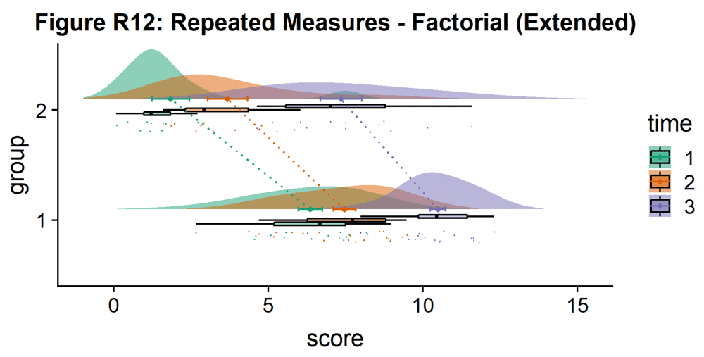]( https://wellcomeopenresearch.s3.amazonaws.com/manuscripts/16574/5019bc28-6d22-4161-958e-49d66f5eef1f_Figure R12.gif)
{#d7963e4824} [ ]( https://wellcomeopenresearch.s3.amazonaws.com/manuscripts/16574/5019bc28-6d22-4161-958e-49d66f5eef1f_Figure R12.gif)
That's it! We hope you'll be able to use this tutorial to find great illustrations for your data, and that we've given you an idea of some of the different ways you can customize your raincloud plots. Next, we'll consider how to reproduce these steps in Python and Matlab.{#d7963e4830} {#d7963e4834}
而已!我们希望您能够使用本教程为您的数据找到精彩的插图,并且我们已经让您了解了一些可以自定义雨云图的不同方法。接下来,我们将考虑如何在Python和Matlab中重现这些步骤。{#d7963e4830} {#d7963e4834}
How to Make it Rain in Python
Python is an open source programming language ( https://www.python.org ) that has recently become extremely popular within data science and statistical machine learning. Our interactive Python tutorial can be found at the following URL:{#d7963e4841}
Python是一种开源编程语言( https://www.python.org ),最近在数据科学和统计机器学习中变得非常流行。我们的交互式Python教程可以在以下URL找到:{#d7963e4841}
The tutorial follows the footsteps of the R tutorial to guide you in the creation and customization of Raincloud plots. The Python implementation of Raincloud Plots is a package named PtitPrince ( https://github.com/pog87/PtitPrince ), written on the top of seaborn. Seaborn (
本教程遵循R教程的脚步,指导您创建和定制Raincloud图。 Raincloud Plots的Python实现是一个名为PtitPrince的包( https://github.com/pog87/PtitPrince),写在seaborn的顶部。 Seaborn( https://seaborn.pydata.org {#d7963e4854}) is a Python plotting library written as an extension to the Python graphic library matplotlib (
{#d7963e4854})是一个Python绘图库,作为Python图形库matplotlib的扩展而编写( https://matplotlib.org {#d7963e4857}) supporting aesthetically pleasing plots and to work directly with pandas dataframes. The tutorial can be run interactively in the browser at:{#d7963e4851}
{#d7963e4857})支持美学上令人愉悦的情节,并直接与熊猫数据帧一起工作。该教程可以在浏览器中以交互方式运行:{#d7963e4851}
As first step, we will load the same dataset used before and visualize the distribution of each measure as a simple barplot with errorbars:{#d7963e4867}
作为第一步,我们将加载之前使用的相同数据集,并将每个度量的分布可视化为带有错误栏的简单条形图:{#d7963e4867}
import pandas as pd
import ptitprince as pt
import seaborn as sns
import matplotlib.pyplot as plt
sns.set(style="whitegrid",font_scale=2)
import matplotlib.collections as clt

df = pd.read_csv ("simdat.csv", sep= ",")

sns.barplot(x = "group", y = "score", data = df, capsize= .1)
{#d7963e4960} []( https://wellcomeopenresearch.s3.amazonaws.com/manuscripts/16574/5019bc28-6d22-4161-958e-49d66f5eef1f_Figure P1.gif)
{#d7963e4960} [ ]( https://wellcomeopenresearch.s3.amazonaws.com/manuscripts/16574/5019bc28-6d22-4161-958e-49d66f5eef1f_Figure P1.gif)
This plot can give the reader a first idea of the dataset: which group has a larger mean value, and whether this difference is likely to be significant or not. Only the mean of each group score and the standard deviation is visualized in this plot.{#d7963e4965}
该图可以为读者提供数据集的第一个概念:哪个组具有更大的平均值,以及这种差异是否可能是显着的。在该图中仅显示每组评分的平均值和标准偏差。{#d7963e4965}
To have an idea of the distribution of our dataset we can plot a "cloud", a smoothed version of the histogram:{#d7963e4968}
为了了解我们的数据集的分布,我们可以绘制一个"云",一个平滑的直方图版本:{#d7963e4968}
# plotting the clouds
f, ax = plt.subplots(figsize=(7, 5))
dy="group"; dx="score"; ort="h"; pal = sns.color_palette(n_colors=1)

ax=pt.half_violinplot( x = dx, y = dy, data = df, palette = pal,
      bw = .2, cut = 0.,scale = "area", width = .6, inner = None,
      orient = ort)
{#d7963e5126} []( https://wellcomeopenresearch.s3.amazonaws.com/manuscripts/16574/5019bc28-6d22-4161-958e-49d66f5eef1f_Figure P2.gif)
{#d7963e5126} [ ]( https://wellcomeopenresearch.s3.amazonaws.com/manuscripts/16574/5019bc28-6d22-4161-958e-49d66f5eef1f_Figure P2.gif)
To have a more precise idea of the distribution and illustrate potential outliers or other patterns within the data, we now add the "rain", a simple monodimensional representation of the data points:{#d7963e5131}
为了更准确地了解分布并说明数据中潜在的异常值或其他模式,我们现在添加"rain",即数据点的简单单维表示:{#d7963e5131}
# adding the rain
f, ax = plt.subplots(figsize=(7, 5))
ax=pt.half_violinplot( x = dx, y = dy, data = df, palette = pal,
       bw = .2, cut = 0.,scale = "area", width = .6, inner = None,
      orient = ort)

ax=sns.stripplot( x = dx, y = dy, data = df, palette = pal,
     edgecolor = "white",size = 3, jitter = 0, zorder = 0,
     orient = ort)
{#d7963e5314} []( https://wellcomeopenresearch.s3.amazonaws.com/manuscripts/16574/5019bc28-6d22-4161-958e-49d66f5eef1f_Figure P3.gif)
{#d7963e5314} [ ]( https://wellcomeopenresearch.s3.amazonaws.com/manuscripts/16574/5019bc28-6d22-4161-958e-49d66f5eef1f_Figure P3.gif)
# adding jitter to the rain
f, ax = plt.subplots(figsize=(7, 5))
ax=pt.half_violinplot( x = dx, y = dy, data = df, palette = pal,
      bw = .2, cut = 0.,scale = "area", width = .6, inner = None,
      orient = ort)

ax=sns.stripplot( x = dx, y = dy, data = df, palette = pal,
     edgecolor = "white",size = 3, jitter = 1, zorder = 0,
     orient = ort)
{#d7963e5496} []( https://wellcomeopenresearch.s3.amazonaws.com/manuscripts/16574/5019bc28-6d22-4161-958e-49d66f5eef1f_Figure P4.gif)
{#d7963e5496} [ ]( https://wellcomeopenresearch.s3.amazonaws.com/manuscripts/16574/5019bc28-6d22-4161-958e-49d66f5eef1f_Figure P4.gif)
This gives a good idea of the distribution of the data points, but the median and the quartiles are not obvious, making it hard to determine statistical differences at a glance. Hence, we add an "empty" boxplot to show median, quartiles and outliers:{#d7963e5502}
这样可以很好地了解数据点的分布,但中位数和四分位数并不明显,因此很难一目了然地确定统计差异。因此,我们添加一个"空"箱图,以显示中位数,四分位数和异常值:{#d7963e5502}
#adding the boxplot with quartiles
f, ax = plt.subplots(figsize=(7, 5))
ax=pt.half_violinplot( x = dx, y = dy, data = df, palette = pal,
       bw = .2, cut = 0.,scale = "area", width = .6, inner = None,
       orient = ort)

ax=sns.stripplot( x = dx, y = dy, data = df, palette = pal,
       edgecolor = "white", size = 3, jitter = 1, zorder = 0,
       orient = ort)

ax=sns.boxplot( x = dx, y = dy, data = df, color = "black",
       width = .15, zorder = 10, showcaps = True,
       boxprops = {'facecolor':'none', "zorder":10}, showfliers=True,
       whiskerprops = {'linewidth':2, "zorder":10},
       saturation = 1, orient = ort)
{#d7963e5838} []( https://wellcomeopenresearch.s3.amazonaws.com/manuscripts/16574/5019bc28-6d22-4161-958e-49d66f5eef1f_Figure P5.gif)
{#d7963e5838} [ ]( https://wellcomeopenresearch.s3.amazonaws.com/manuscripts/16574/5019bc28-6d22-4161-958e-49d66f5eef1f_Figure P5.gif)
Now we can set a color palette to characterize the two groups:{#d7963e5843}
现在我们可以设置一个调色板来表征这两个组:{#d7963e5843}
#adding color
pal = "Set2"
f, ax = plt.subplots(figsize=(7, 5))
ax=pt.half_violinplot( x = dx, y = dy, data = df, palette = pal,
     bw = .2, cut = 0.,scale = "area", width = .6,
     inner = None, orient = ort)

ax=sns.stripplot( x = dx, y = dy, data = df, palette = pal,
      edgecolor = "white",size = 3, jitter = 1, zorder = 0,
      orient = ort)

ax=sns.boxplot( x = dx, y = dy, data = df, color = "black",
      width = .15, zorder = 10, showcaps = True,
      boxprops = {'facecolor':'none', "zorder":10}, showfliers=True,
      whiskerprops = {'linewidth':2, "zorder":10},
      saturation = 1, orient = ort)
{#d7963e6177} []( https://wellcomeopenresearch.s3.amazonaws.com/manuscripts/16574/5019bc28-6d22-4161-958e-49d66f5eef1f_Figure P6.gif)
{#d7963e6177} [ ]( https://wellcomeopenresearch.s3.amazonaws.com/manuscripts/16574/5019bc28-6d22-4161-958e-49d66f5eef1f_Figure P6.gif)
This plot is now both informative and aesthetically pleasing but written in far too many lines of code. We can use the function pt.Raincloud to add some automation:{#d7963e6183}
这个情节现在既有信息又美观,但是用太多的代码编写。我们可以使用函数pt.Raincloud来添加一些自动化:{#d7963e6183}
#same thing with a single command: now x **must** be the categorical value
dx = "group"; dy = "score"; ort = "h"; pal = "Set2"; sigma = .2

ax=pt.RainCloud(x = dx, y = dy, data = df, palette = pal,
      bw = sigma,width_viol = .6, figsize = (7,5), orient = ort)
{#d7963e6322} [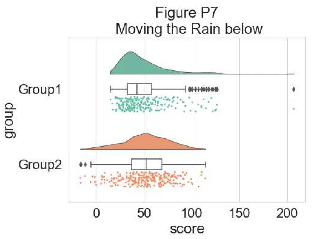]( https://wellcomeopenresearch.s3.amazonaws.com/manuscripts/16574/5019bc28-6d22-4161-958e-49d66f5eef1f_Figure P7.gif)
{#d7963e6322} [ ]( https://wellcomeopenresearch.s3.amazonaws.com/manuscripts/16574/5019bc28-6d22-4161-958e-49d66f5eef1f_Figure P7.gif)
The 'move' parameter can be used to shift the rain below the boxplot, giving better visibility of the raw data in some instances:{#d7963e6327}
'move'参数可用于将降雨量移到箱线图下方,在某些情况下可以更好地查看原始数据:{#d7963e6327}
#moving the rain below the boxplot
dx = "group"; dy = "score"; ort = "h"; pal = "Set2"; sigma = .2

ax=pt.RainCloud(x = dx, y = dy, data = df, palette = pal,
     bw = sigma, width_viol = .6, figsize = (7,5),
     orient = ort, move = .2)
{#d7963e6474} []( https://wellcomeopenresearch.s3.amazonaws.com/manuscripts/16574/5019bc28-6d22-4161-958e-49d66f5eef1f_Figure P8.gif)
{#d7963e6474} [ ]( https://wellcomeopenresearch.s3.amazonaws.com/manuscripts/16574/5019bc28-6d22-4161-958e-49d66f5eef1f_Figure P8.gif)
Further, the raincloud function works equally well with a list or numpy.array, if you prefer to use those instead of a dataframe input:{#d7963e6480}
此外,如果您更喜欢使用它们而不是数据框输入,则raincloud函数与list或numpy.array的效果相同:{#d7963e6480}
# Usage with a list/np.array input
dx = list(df["group"]); dy = list(df["score"])

ax=pt.RainCloud(x = dx, y = dy, palette = pal, bw = sigma,
      width_viol = .6, figsize = (7,5), orient = ort)
{#d7963e6583} [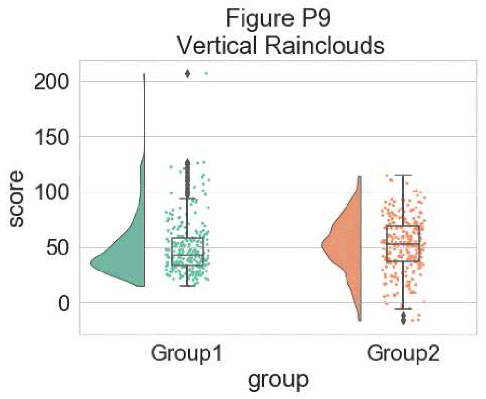]( https://wellcomeopenresearch.s3.amazonaws.com/manuscripts/16574/5019bc28-6d22-4161-958e-49d66f5eef1f_Figure P9.gif)
{#d7963e6583} [ ]( https://wellcomeopenresearch.s3.amazonaws.com/manuscripts/16574/5019bc28-6d22-4161-958e-49d66f5eef1f_Figure P9.gif)
For some data, you may want to flip the orientation of the raincloud to a 'petit prince' plot. You can do this with the 'orient' flag in the pt.RainCloud Function:{#d7963e6588}
对于某些数据,您可能希望将raincloud的方向翻转为"小王子"情节。您可以使用pt.RainCloud函数中的'orient'标志执行此操作:{#d7963e6588}
# Changing orientation
dx="group"; dy="score"; ort="v"; pal = "Set2"; sigma = .2

ax=pt.RainCloud(x = dx, y = dy, data = df, palette = pal,
       bw = sigma,width_viol = .5, figsize = (7,5), orient = ort)
{#d7963e6717} []( https://wellcomeopenresearch.s3.amazonaws.com/manuscripts/16574/5019bc28-6d22-4161-958e-49d66f5eef1f_Figure P10.gif)
{#d7963e6717} [ ]( https://wellcomeopenresearch.s3.amazonaws.com/manuscripts/16574/5019bc28-6d22-4161-958e-49d66f5eef1f_Figure P10.gif)
You can also change the smoothing kernel used to generate the probability distribution function of the data. To do this, you adjust the sigma parameter:{#d7963e6723}
您还可以更改用于生成数据的概率分布函数的平滑内核。为此,您需要调整sigma参数:{#d7963e6723}
#changing cloud smoothness
dx="group"; dy="score"; ort="h"; pal = "Set2"; sigma = .05

ax=pt.RainCloud(x = dx, y = dy, data = df, palette = pal,
      bw = sigma,width_viol = .6, figsize = (7,5), orient = ort)
{#d7963e6841} []( https://wellcomeopenresearch.s3.amazonaws.com/manuscripts/16574/5019bc28-6d22-4161-958e-49d66f5eef1f_Figure P11.gif)
{#d7963e6841} [ ]( https://wellcomeopenresearch.s3.amazonaws.com/manuscripts/16574/5019bc28-6d22-4161-958e-49d66f5eef1f_Figure P11.gif)
Finally, using the pointplot flag you can add a line connecting group mean values. This can be useful for more complex datasets, for example repeated measures or factorial data. Below we illustrate a few different approaches to plotting such data using rainclouds, by changing the hue, opacity, or dodge element of the individual plots:{#d7963e6846}
最后,使用pointplot标志,您可以添加连接组平均值的线。这对于更复杂的数据集非常有用,例如重复测量或因子数据。下面我们通过改变单个图的色调,不透明度或闪避元素来说明使用raincloud绘制此类数据的几种不同方法:{#d7963e6846}
#adding a red line connecting the groups' mean value (useful for longitudinal data)
dx="group"; dy="score"; ort="h"; pal = "Set2"; sigma = .2

ax=pt.RainCloud(x = dx, y = dy, data = df, palette = pal,
      bw = sigma, width_viol = .6, figsize = (7,5),
      orient = ort, pointplot = True)
{#d7963e6979} []( https://wellcomeopenresearch.s3.amazonaws.com/manuscripts/16574/5019bc28-6d22-4161-958e-49d66f5eef1f_Figure P12.gif)
{#d7963e6979} [ ]( https://wellcomeopenresearch.s3.amazonaws.com/manuscripts/16574/5019bc28-6d22-4161-958e-49d66f5eef1f_Figure P12.gif)
Another flexible option is to use Facet Grids to separate different groups or factor levels, illustrated below:{#d7963e6985}
另一个灵活的选择是使用Facet Grids来分隔不同的组或因子级别,如下所示:{#d7963e6985}
# Rainclouds with FacetGrid
g = sns.FacetGrid(df, col = "gr2", height = 6)
g = g.map_dataframe(pt.RainCloud, x = "group", y = "score",
       data = df, orient = "h", ax = g.axes)
{#d7963e7070} []( https://wellcomeopenresearch.s3.amazonaws.com/manuscripts/16574/5019bc28-6d22-4161-958e-49d66f5eef1f_Figure P13.gif)
{#d7963e7070} [ ]( https://wellcomeopenresearch.s3.amazonaws.com/manuscripts/16574/5019bc28-6d22-4161-958e-49d66f5eef1f_Figure P13.gif)
As an alternative, it is possible to use the hue input for plotting different sub-groups directly over one another, facilitating their comparison:{#d7963e7075}
作为替代方案,可以使用色调输入直接绘制不同的子组,以便于比较:{#d7963e7075}
# Hue Input for Subgroups
dx="group"; dy="score"; dhue="gr2"; ort="h" pal="Set2"; sigma = .2

ax=pt.RainCloud(x = dx, y = dy, hue = dhue, data = df,
      palette = pal, bw = sigma,width_viol = .7, figsize = (12,5),
      orient = ort)
{#d7963e7217} []( https://wellcomeopenresearch.s3.amazonaws.com/manuscripts/16574/5019bc28-6d22-4161-958e-49d66f5eef1f_Figure P14.gif)
{#d7963e7217} [ ]( https://wellcomeopenresearch.s3.amazonaws.com/manuscripts/16574/5019bc28-6d22-4161-958e-49d66f5eef1f_Figure P14.gif)
To improve the readability of this plot, we adjust the alpha-level using the associated flag (0--1 alpha intensity):{#d7963e7222}
为了提高此图的可读性,我们使用相关标志(0--1 alpha强度)调整alpha级别:{#d7963e7222}
# Setting alpha level
ax=pt.RainCloud(x = dx, y = dy, hue = dhue, data = df,
      palette = pal, bw = sigma, width_viol = .7, figsize = (12,5),
      orient = ort , alpha = .65)
{#d7963e7319} []( https://wellcomeopenresearch.s3.amazonaws.com/manuscripts/16574/5019bc28-6d22-4161-958e-49d66f5eef1f_Figure P15.gif)
{#d7963e7319} [ ]( https://wellcomeopenresearch.s3.amazonaws.com/manuscripts/16574/5019bc28-6d22-4161-958e-49d66f5eef1f_Figure P15.gif)
Rather than letting the two boxplots obscure one another, we can set the dodge flag to true, adding interpretability:{#d7963e7324}
我们可以将闪避标志设置为true,而不是让两个箱图彼此模糊,增加可解释性:{#d7963e7324}
#The Dodge Flag
ax=pt.RainCloud(x = dx, y = dy, hue = dhue, data = df,
      palette = pal, bw = sigma,width_viol = .7, figsize = (12,5),
      orient = ort , alpha = .65, dodge = True)
{#d7963e7421} []( https://wellcomeopenresearch.s3.amazonaws.com/manuscripts/16574/5019bc28-6d22-4161-958e-49d66f5eef1f_Figure P16.gif)
{#d7963e7421} [ ]( https://wellcomeopenresearch.s3.amazonaws.com/manuscripts/16574/5019bc28-6d22-4161-958e-49d66f5eef1f_Figure P16.gif)
Finally, we may want to add a traditional line-plot to our graph to aid in the detection of factorial main effects and interactions. As an example, we've plotted the mean within each boxplot:{#d7963e7426}
最后,我们可能想在图表中添加传统的线图,以帮助检测因子主效应和相互作用。例如,我们在每个箱线图中绘制了均值:{#d7963e7426}
#same, with dodging and line
ax=pt.RainCloud(x = dx, y = dy, hue = dhue, data = df,
     palette = pal, bw = sigma, width_viol = .7,figsize = (12,5),
      orient = ort , alpha = .65, dodge = True, pointplot = True)
{#d7963e7533} []( https://wellcomeopenresearch.s3.amazonaws.com/manuscripts/16574/5019bc28-6d22-4161-958e-49d66f5eef1f_Figure P17.gif)
{#d7963e7533} [ ]( https://wellcomeopenresearch.s3.amazonaws.com/manuscripts/16574/5019bc28-6d22-4161-958e-49d66f5eef1f_Figure P17.gif)
Here is the same plot, but now with the individual observations moved below the boxplots again using the 'move' parameter:{#d7963e7538}
这是相同的情节,但现在使用'move'参数将个别观察结果再次移到箱形图下方:{#d7963e7538}
#moving the rain under the boxplot
ax=pt.RainCloud(x = dx, y = dy, hue = dhue, data = df,
     palette = pal, bw = sigma, width_viol = .7,figsize = (12,5),
      orient = ort , alpha = .65, dodge = True, pointplot = True,
     move = .2)
{#d7963e7654} []( https://wellcomeopenresearch.s3.amazonaws.com/manuscripts/16574/5019bc28-6d22-4161-958e-49d66f5eef1f_Figure P18.gif)
{#d7963e7654} [ ]( https://wellcomeopenresearch.s3.amazonaws.com/manuscripts/16574/5019bc28-6d22-4161-958e-49d66f5eef1f_Figure P18.gif)
As our last example, we'll consider a complex repeated measures design with two groups and three timepoints. The goal is to illustrate our complex interactions and main-effects, while preserving the transparent nature of the raincloud plot:{#d7963e7659}
作为我们的最后一个例子,我们将考虑一个具有两组和三个时间点的复杂重复测量设计。目标是说明我们复杂的相互作用和主效应,同时保留raincloud情节的透明性:{#d7963e7659}
# Load in the repeated data
df_rep = pd.read_csv ("repeated_measures_data.csv", sep= ",",
        header = None)
df_rep.columns = ["score",  "timepoint", "group"]

# Plot the repeated measures data
dx = "group"; dy="score"; dhue="timepoint"
ort="h"; pal="Set2"; sigma = .2

ax=pt.RainCloud(x = dx, y = dy, hue = dhue, data = df_rep,
     palette = pal, bw = sigma, width_viol = .7,figsize = (12,5),
      orient = ort , alpha = .65, dodge = True, pointplot = True,
     move = .2)
{#d7963e7882} []( https://wellcomeopenresearch.s3.amazonaws.com/manuscripts/16574/5019bc28-6d22-4161-958e-49d66f5eef1f_Figure P19.gif)
{#d7963e7882} [ ]( https://wellcomeopenresearch.s3.amazonaws.com/manuscripts/16574/5019bc28-6d22-4161-958e-49d66f5eef1f_Figure P19.gif)
The function is flexible enough that you can flip the ordering of the factors around simply by changing which variable informs the hue parameter:{#d7963e7887}
该函数非常灵活,您可以通过更改哪个变量通知hue参数来翻转因子的顺序:{#d7963e7887}
# Now with the group as hue
dx = "timepoint"; dy = "score"; dhue = "group"
ax=pt.RainCloud(x = dx, y = dy, hue = dhue, data = df_rep,
      palette = pal, bw = sigma, width_viol = .7, figsize = (12,5),
      orient = ort, alpha = .65, dodge = True, pointplot = True,
      move = .2)
{#d7963e8042} []( https://wellcomeopenresearch.s3.amazonaws.com/manuscripts/16574/5019bc28-6d22-4161-958e-49d66f5eef1f_Figure P20.gif)
{#d7963e8042} [ ]( https://wellcomeopenresearch.s3.amazonaws.com/manuscripts/16574/5019bc28-6d22-4161-958e-49d66f5eef1f_Figure P20.gif)
That's it! Hopefully this tutorial has given you an idea of some of the different ways you can produce raincloud plots in Python. Next, we'll describe how to produce these plots in Matlab.{#d7963e8047} {#d7963e8051}
而已!希望本教程能让您了解在Python中生成raincloud图的一些不同方法。接下来,我们将描述如何在Matlab中生成这些图。{#d7963e8047} {#d7963e8051}
How to Make it Rain in Matlab
Matlab (Mathworks Inc.) is a proprietary mathematical programming language used widely in engineering, the physical sciences, and neuroscience. The code for this tutorial can be found at:{#d7963e8056}
Matlab(Mathworks Inc.)是一种专有的数学编程语言,广泛应用于工程,物理科学和神经科学。可以在以下位置找到本教程的代码:{#d7963e8056}
https://github.com/RainCloudPlots/RainCloudPlots/tree/master/tutorial_matlab{#d7963e8060}
https://github.com/RainCloudPlots/RainCloudPlots/tree/master/tutorial_matlab{#d7963e8060}Here you can also find functions to create raincloud-plots (
在这里你还可以找到创建raincloud-plot的功能( raincloud_plot.m and rm_raincloud.m {#d7963e8065}), as well as a "live notebook" (
{#d7963e8065}),以及"现场笔记本"( raincloud_plots_tutorial.mlx {#d7963e8068}) which walks the user through the customization of various raincloud plots.{#d7963e8063}
{#d7963e8068})引导用户完成各种raincloud情节的定制。{#d7963e8063}
First, we'll set up our path and use the colorbrewer function to define some nice colour palettes:{#d7963e8072}
首先,我们将设置路径并使用colorbrewer函数定义一些漂亮的调色板:{#d7963e8072}
% set up a dynamic path
% script must be run from parent directory containing all three tutorial
% directories (i.e., the one 'above' the directory 'tutorial_matlab')

pardir = pwd;
figdir = fullfile(pardir, 'figs', 'tutorial_matlab');
if ~exist('figdir', 'dir')
     mkdir(figdir);
end

% make sure functions to generate plots are on the path
codedir = fullfile(pardir, 'tutorial_matlab');
addpath(codedir);

try
     % get nice colours from colorbrewer
     % (https://uk.mathworks.com/matlabcentral/fileexchange/34087-cbrewer---colorbrewer-schemes-for-matlab)
     [cb] = cbrewer('qual', 'Set3', 12, 'pchip');
catch
     % if you don't have colorbrewer, accept these far more boring colours
     cb = [0.5 0.8 0.9; 1 1 0.7; 0.7 0.8 0.9; 0.8 0.5 0.4; 0.5 0.7 0.8; 1 0.8 0.5; 0.7 1 0.4; 1 0.7 1; 0.6 0.6 0.6; 0.7 0.5 0.7; 0.8 0.9 0.8; 1 1 0.4];
end

cl(1, :) = cb(4, :);
cl(2, :) = cb(1, :);

fig_position = [200 200 600 400]; % coordinates for figures
Now we'll generate some datapoints with similar means and standard deviations; the first is drawn from a random normal distribution and the second from a random exponential distribution. We'll plot these same data repeatedly in different ways further down:{#d7963e8188}
现在我们将生成一些具有类似方法和标准偏差的数据点;第一个是从随机正态分布中提取的,第二个是从随机指数分布中提取的。我们将以不同的方式重复绘制这些相同的数据:{#d7963e8188}
n = 250;

% set a random number generator seed for reproducible results
rng(123)

d{1} = [exprnd(5, 1, n) + 15]';
d{2} = [(randn(1, n) *5) + 20]';

means = cellfun(@mean, d);
variances = cellfun(@std, d);
Let's create a quick bar graph of these data. This is the kind of standard visualization you see in many papers, depicting the mean of the data plus standard deviation:{#d7963e8254}
让我们创建这些数据的快速条形图。这是您在许多论文中看到的标准可视化,描述了数据的平均值加上标准偏差:{#d7963e8254}
f1 = figure('Position',fig_position); hold on;
h = bar(means, 'FaceColor', 'flat', 'LineWidth',.9);

h(1).CData(1, :) = cl(1, :);
h(1).CData(2, :) = cl(2, :);

e = errorbar(1:2, means, variances, '.k', 'LineWidth',.9);
set(gca, 'XTick', 1:2)
title('Bar Plot');

% save
print(f1, fullfile(figdir, '1bar.png'), '-dpng');
{#d7963e8372} []( https://wellcomeopenresearch.s3.amazonaws.com/manuscripts/16574/5019bc28-6d22-4161-958e-49d66f5eef1f_Figure M1.gif)
{#d7963e8372} [ ]( https://wellcomeopenresearch.s3.amazonaws.com/manuscripts/16574/5019bc28-6d22-4161-958e-49d66f5eef1f_Figure M1.gif)
As you can see, this tells you something about the data, but a lot of really useful and important information is hidden such as the 'shape' or distribution of the data and the raw observations themselves. A histogram nicely shows some of what we're missing:{#d7963e8378}
正如您所看到的,这会告诉您有关数据的信息,但会隐藏许多非常有用且重要的信息,例如数据的"形状"或分布以及原始观察本身。直方图很好地展示了我们遗漏的一些内容:{#d7963e8378}
f2 = figure('Position', fig_position);
subplot(1, 2, 1)
[n1, x1] = hist(d{1}, 30);
bar(x1, n1, 'FaceColor', cl(1,:), 'EdgeColor', 'k');
title('Histogram')
subplot(1, 2, 2)
[n2, x2] = hist(d{2}, 30);
bar(x2, n2, 'FaceColor', cl(2,:), 'EdgeColor', 'none');

% save
print(f2, fullfile(figdir, '2hist.png'), '-dpng');
{#d7963e8500} []( https://wellcomeopenresearch.s3.amazonaws.com/manuscripts/16574/5019bc28-6d22-4161-958e-49d66f5eef1f_Figure M2.gif)
{#d7963e8500} [ ]( https://wellcomeopenresearch.s3.amazonaws.com/manuscripts/16574/5019bc28-6d22-4161-958e-49d66f5eef1f_Figure M2.gif)
However, now we've lost the summary data. The raincloud plot tries to bring these elements together in one intuitive plot. You can use the 'raincloud_plot.m' function accompanying this tutorial to produce these plots in Matlab:{#d7963e8505}
但是,现在我们丢失了摘要数据。 raincloud图试图在一个直观的图中将这些元素组合在一起。您可以使用本教程附带的"raincloud_plot.m"函数在Matlab中生成这些图:{#d7963e8505}
f3 = figure('Position', fig_position);
subplot(2, 1, 1)
h1 = raincloud_plot('d{1}, 'box_on', 1);
title('Raincloud Plot: Group 1')
set(gca,'XLim', [0 40]);
box off
subplot(2, 1, 2)
h2 = raincloud_plot(d{2}, 'box_on', 1);
title('Raincloud Plot: Group 2');
set(gca,'XLim', [0 40]);
box off


% save
print(f3, fullfile(figdir, '3Rain1.png'), '-dpng');
{#d7963e8655} []( https://wellcomeopenresearch.s3.amazonaws.com/manuscripts/16574/5019bc28-6d22-4161-958e-49d66f5eef1f_Figure M3.gif)
{#d7963e8655} [ ]( https://wellcomeopenresearch.s3.amazonaws.com/manuscripts/16574/5019bc28-6d22-4161-958e-49d66f5eef1f_Figure M3.gif)
This gives us the distribution (probability density plot), summary data (box plot), and raw observations all in one place. Now we'll walk you through some of the options of the function, which you can use to change various aesthetic properties of the plot. The function only requires a vector of the data you want to plot as the input. Additionally, there are a variety of optional flags you can call to turn the boxplots on and off, to alter ('dodge') the position of the boxes and dots, and to change various aesthetics such as linewidth, colors, and so on. For example, by setting a few different flags we can create more colorful plots:{#d7963e8661}
这给了我们在一个地方的分布(概率密度图),摘要数据(箱形图)和原始观测。现在我们将向您介绍该功能的一些选项,您可以使用这些选项来更改绘图的各种美学属性。该功能仅需要您要绘制的数据矢量作为输入。此外,您可以调用多种可选标记来打开和关闭箱形图,改变("闪避")盒子和点的位置,以及改变各种美学,如线宽,颜色等。例如,通过设置几个不同的标志,我们可以创建更多彩色图:{#d7963e8661}
f4 = figure('Position', fig_position);
subplot(2, 1, 1)
h1 = raincloud_plot(d{1}, 'box_on', 1);
title('Raincloud Plot: Default Plot')
set(gca,'XLim', [0 40]);
box off
subplot(2, 1, 2)
h2 = raincloud_plot(d{1}, 'box_on', 1, 'box_dodge', 1, 'box_dodge_amount',...
0, 'dot_dodge_amount', .3, 'color', cb(1,:), 'cloud_edge_col', cb(1,:));
title('Raincloud Plot: Some Aesthetic Options');
set(gca,'XLim', [0 40]);
box off

% save
print(f4, fullfile(figdir, '4Rain2.png'), '-dpng');
{#d7963e8858} []( https://wellcomeopenresearch.s3.amazonaws.com/manuscripts/16574/5019bc28-6d22-4161-958e-49d66f5eef1f_Figure M4.gif)
{#d7963e8858} [ ]( https://wellcomeopenresearch.s3.amazonaws.com/manuscripts/16574/5019bc28-6d22-4161-958e-49d66f5eef1f_Figure M4.gif)
The function returns a cell array for various figure parts, so you can also call the base function and then change things with normal 'set' commands, like so:{#d7963e8863}
该函数返回各个图形部分的单元格数组,因此您也可以调用基本函数,然后使用正常的"set"命令进行更改,如下所示:{#d7963e8863}
f5 = figure('Position', fig_position);
subplot(2, 1, 1)
h1 = raincloud_plot(d{1}, 'box_on', 1);
title('Raincloud Plot: Default Plot')
set(gca,'XLim', [0 40]);
box off
subplot(2, 1, 2)
h2 =  raincloud_plot(d{1}, 'box_on', 1);
title('Raincloud Plot: Some Aesthetic Options');
set(h2{1},'FaceColor', cb(1, :)) % handles 1-6 are the cloud area,
scatterpoints, and boxplot elements respectively
set(h2{2}, 'MarkerEdgeColor', 'red') %
set(gca,'XLim', [0 40]);
box off

% save
print(f5, fullfile(figdir, '5Rain3.png'), '-dpng');
{#d7963e9046} [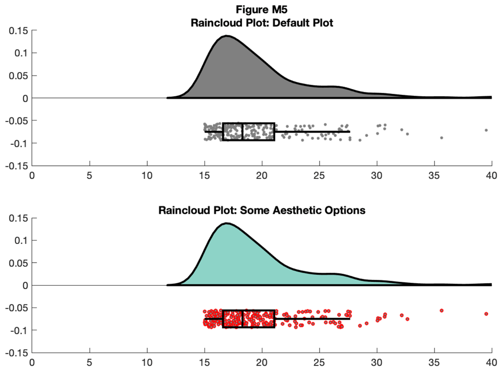]( https://wellcomeopenresearch.s3.amazonaws.com/manuscripts/16574/5019bc28-6d22-4161-958e-49d66f5eef1f_Figure M5.gif)
{#d7963e9046} [ ]( https://wellcomeopenresearch.s3.amazonaws.com/manuscripts/16574/5019bc28-6d22-4161-958e-49d66f5eef1f_Figure M5.gif)
You can also control the smoothness of the probability density function by calling the 'bandwidth' parameter. Additionally, if you have Cyril Pernet's robust statistics toolbox on your path, you can call the 'rash' function for an alternative kernel density function:{#d7963e9052}
您还可以通过调用'bandwidth'参数来控制概率密度函数的平滑度。此外,如果你的路径上有Cyril Pernet强大的统计工具箱,你可以调用'rash'函数来获得另一个内核密度函数:{#d7963e9052}
f6 = figure('Position', fig_position);
subplot(2, 1, 1)
h1 = raincloud_plot(d{1}, 'box_on', 1, 'color', cb(1,:), 'bandwidth', .2,
'density_type', 'ks');
title('Raincloud Plot: Reduced Smoothing, Kernel Density')
set(gca,'XLim', [0 40]);
box off
subplot(2,1,2)
h2 = raincloud_plot(d{1}, 'box_on', 1, 'color', cb(2,:), 'bandwidth', 1,
'density_type', 'rash');
title('Raincloud Plot: Rash Density Estimate')
set(gca,'XLim', [0 40]);
box off

% save
print(f6, fullfile(figdir, '6Rain4.png'), '-dpng');
{#d7963e9255} []( https://wellcomeopenresearch.s3.amazonaws.com/manuscripts/16574/5019bc28-6d22-4161-958e-49d66f5eef1f_Figure M6.gif)
{#d7963e9255} [ ]( https://wellcomeopenresearch.s3.amazonaws.com/manuscripts/16574/5019bc28-6d22-4161-958e-49d66f5eef1f_Figure M6.gif)
Here, we'll use the dot and box dodge options to create an overlapping set of raincloud plots, useful for group comparison. The function can be called repeatedly (e.g., from within a loop) - each iteration will overlay the previous. Note that here we're using the 'alpha' parameter to make the plot area see-through:{#d7963e9260}
在这里,我们将使用点和框闪避选项来创建一组重叠的raincloud图,这对于组比较非常有用。可以重复调用该函数(例如,从循环内) - 每次迭代将覆盖前一个。请注意,我们在这里使用'alpha'参数使绘图区域透明:{#d7963e9260}
% example 1
f7 = figure('Position', fig_position);
subplot(1, 2 ,1)
h1 = raincloud_plot(d{1}, 'box_on', 1, 'color', cb(1,:), 'alpha', 0.5,...
    'box_dodge', 1, 'box_dodge_amount', .15, 'dot_dodge_amount', .15,...
    'box_col_match', 0);
h2 = raincloud_plot(d{2}, 'box_on', 1, 'color', cb(4,:), 'alpha', 0.5,...
    'box_dodge', 1, 'box_dodge_amount', .35, 'dot_dodge_amount', .35, 'box_col_match', 0);
legend([h1{1} h2{1}], {'Group 1', 'Group 2'})
title('A) Dodge Options Example 1')
set(gca,'XLim', [0 40], 'YLim', [-.075 .15]);
box off

% example 2
subplot(1, 2, 2)
h1 = raincloud_plot(d{1}, 'box_on', 1, 'color', cb(1,:), 'alpha', 0.5,...
    'box_dodge', 1, 'box_dodge_amount', .15, 'dot_dodge_amount', .35,...
    'box_col_match', 1);
h2 = raincloud_plot(d{2}, 'box_on', 1, 'color', cb(4,:), 'alpha', 0.5,...
    'box_dodge', 1, 'box_dodge_amount', .55, 'dot_dodge_amount', .75,...
    'box_col_match', 1);
legend([h1{1} h2{1}], {'Group 1', 'Group 2'})
title('B) Dodge Options Example 2')
set(gca,'XLim', [0 40]);
box off

% save
print(f7, fullfile(figdir, '7Rain5.png'), '-dpng');
{#d7963e9705} []( https://wellcomeopenresearch.s3.amazonaws.com/manuscripts/16574/5019bc28-6d22-4161-958e-49d66f5eef1f_Figure M7.gif)
{#d7963e9705} [ ]( https://wellcomeopenresearch.s3.amazonaws.com/manuscripts/16574/5019bc28-6d22-4161-958e-49d66f5eef1f_Figure M7.gif)
You can control the jitter and position of the 'raindrops' in the Y-plane by calling the figure handles:{#d7963e9711}
您可以通过调用图形控制柄来控制Y平面中"雨滴"的抖动和位置:{#d7963e9711}
f8 = figure('Position', fig_position);
subplot(2, 1, 1)
h1 = raincloud_plot(d{1}, 'color', cb(5,:));
set(gca,'XLim',[0 40]);
h1{2}.YData = repmat(-0.1, n, 1);

subplot(2, 1, 2)
h2 = raincloud_plot(d{2}, 'color', cb(7,:));
set(gca,'XLim',[0 40]);
h2{2}.YData = repmat(-0.05,n,1);

% save
print(f8, fullfile(figdir, '8Rain6.png'), '-dpng');
{#d7963e9866} []( https://wellcomeopenresearch.s3.amazonaws.com/manuscripts/16574/5019bc28-6d22-4161-958e-49d66f5eef1f_Figure M8.gif)
{#d7963e9866} [ ]( https://wellcomeopenresearch.s3.amazonaws.com/manuscripts/16574/5019bc28-6d22-4161-958e-49d66f5eef1f_Figure M8.gif)
For the final examples, we'll consider a more complex factorial situation where we have multiple groups and observations. To illustrate this, we'll use a more complex implementation of rainclouds encoded in the 'rm_raincloud.m' function.{#d7963e9871}
对于最后的例子,我们将考虑一个更复杂的因子情况,我们有多个组和观察。为了说明这一点,我们将使用在'rm_raincloud.m'函数中编码的更复杂的raincloud实现。{#d7963e9871}
% grab 'repeated_measures_data.csv';
D = dlmread(fullfile(codedir, 'repeated_measures_data.csv'));

% read into cell array of the appropriate dimensions
for i = 1:3
    for j = 1:2
        data{i, j} = D(D(:, 2) == i & D(:, 3) ==j);
    end
end

% make figure
f9  = figure('Position', fig_position);
h   = rm_raincloud(data, cl);
set(gca, 'YLim', [-0.3 1.6]);
title('repeated measures raincloud plot');

% save
print(f9, fullfile(figdir, '9RmRain1.png'), '-dpng');
{#d7963e9986} []( https://wellcomeopenresearch.s3.amazonaws.com/manuscripts/16574/5019bc28-6d22-4161-958e-49d66f5eef1f_Figure M9.gif)
{#d7963e9986} [ ]( https://wellcomeopenresearch.s3.amazonaws.com/manuscripts/16574/5019bc28-6d22-4161-958e-49d66f5eef1f_Figure M9.gif)
As above, 'rm_raincloud.m' returns a cell-array of handles to the various figure parts. We can add aesthetic options by calling these handles.{#d7963e9992}
如上所述,'rm_raincloud.m'返回各种图形部分的句柄单元格数组。我们可以通过调用这些句柄来添加美学选项。{#d7963e9992}
% make figure
f10 = figure('Position', fig_position);
h   = rm_raincloud(data, cl);
set(gca, 'YLim', [-0.3 1.6]);
title('repeated measures raincloud plot - some aesthetic options')

% define new colour
new_cl = [0.2 0.2 0.2];

% change one subset to new colour and alter dot size
h.p{2, 2}.FaceColor         = new_cl;
h.s{2, 2}.MarkerFaceColor   = new_cl;
h.m(2, 2).MarkerEdgeColor   = 'none';
h.m(2, 2).MarkerFaceColor   = new_cl;
h.s{2, 2}.SizeData          = 300;

% save
print(f10, fullfile(figdir, '10RmRain2`.png'), '-dpng');
{#d7963e10081} []( https://wellcomeopenresearch.s3.amazonaws.com/manuscripts/16574/5019bc28-6d22-4161-958e-49d66f5eef1f_Figure M10.gif)
{#d7963e10081} [ ]( https://wellcomeopenresearch.s3.amazonaws.com/manuscripts/16574/5019bc28-6d22-4161-958e-49d66f5eef1f_Figure M10.gif)
That's it! Now you should be ready to customize your Raincloud plots for a variety of different purposes. This concludes our cross-platform tutorial!{#d7963e10086}
而已!现在,您应该准备好为各种不同的目的自定义Raincloud图。我们的跨平台教程到此结束!{#d7963e10086}
Discussion {#d7963e10093}
We hope that our tutorials demonstrate the flexibility of raincloud plots for visualizing data. Raincloud plots build on a rich tradition of data graphics, enabling the user to visualize key parameters for statistical inference in a transparent an aesthetically appealing fashion. In this sense, Rainclouds are part of a wider family of plotting tools such as beeswarms (
我们希望我们的教程能够展示用于可视化数据的raincloud图的灵活性。 Raincloud图基于丰富的数据图形传统,使用户能够以透明和美观的方式可视化统计推断的关键参数。从这个意义上说,Rainclouds是更广泛的绘图工具家族的一部分,如beeswarms(), strip plots (
), strip plots (), and estimation plots (
)和估算图().{#d7963e10096}
).{#d7963e10096}
Indeed, our goal is not to argue for the superiority or novelty of raincloud plots over these and other complementary methods. Our focus is on providing a robust cross-platform tool for creating transparent plots. In general, the modularity of the raincloud plot is a strength, and we encourage the user to think carefully about the choice of individual elements (clouds, rain, & confidence intervals) depending on the particularities of their data.{#d7963e10111}
实际上,我们的目标不是争论雨云的优势或新颖性超过这些和其他补充方法。我们的重点是提供一个强大的跨平台工具来创建透明图。一般来说,raincloud图的模块性是一种优势,我们鼓励用户根据数据的特殊性仔细考虑单个元素(云,雨和置信区间)的选择。{#d7963e10111}
It is worth mentioning that here we envision these three aspects of the raincloud plots as sub-serving particular statistical goals. In our examples, the probability distributions depicted by the split-half violin plot ('clouds') illustrate the sample variance. As such they are excellent tools for assessing how data are distributed and checking assumptions (i.e., violations of normality). Considering this, we caution against the use of clouds in this form for statistical inference at a glance, which is better served by comparing some parameter estimates in relation to their uncertainty. Users who wish to use probability distributions for inference should instead consider a more suitable approach such as estimation plots, or by plotting a smoothed histogram of bootstrapped parameter estimates, or simply by plotting rainclouds with boxplots and/or confidence intervals, as we have done in our tutorial examples. The code provided with this tutorial makes it easy to implement whatever histogram function best suits the needs of the user, simply by substituting the PDF estimation function.{#d7963e10114}
值得一提的是,在这里我们设想雨云图的这三个方面作为子服务的特定统计目标。在我们的例子中,分半小提琴图('云')描绘的概率分布说明了样本方差。因此,它们是评估数据分布方式和检查假设(即违反正常性)的极好工具。考虑到这一点,我们提醒不要使用这种形式的云进行统计推断一目了然,通过比较一些与其不确定性相关的参数估计值可以更好地实现。希望使用概率分布进行推理的用户应该考虑更合适的方法,例如估计图,或者绘制自举参数估计的平滑直方图,或者简单地通过绘制具有箱线图和/或置信区间的雨云,如我们所做的那样我们的教程示例。本教程提供的代码可以轻松实现最适合用户需求的直方图函数,只需替换PDF估算函数即可。{#d7963e10114}
Additionally, at first glance it may seem redundant to plot both raw datapoints ('rain') and data distributions ('clouds'). However, we put forth that plotting both offers several advantages. First, plotting raw datapoints can enable the automated (i.e., machine-readable) recovery of data from plots even when the data underlying the plot has been lost. Second, plotting raw data can facilitate the identification of unexpected patterns within the data, such as ordinality or outliers, which may not be readily apparent from a probability distribution or box-plot alone. As such we recommend the combination of raw data plots and smoothed distributions (however estimated) wherever possible.{#d7963e10117}
此外,乍一看,绘制原始数据点('rain')和数据分布('clouds')似乎是多余的。但是,我们提出绘制两者都有几个优点。首先,绘制原始数据点可以实现从图中自动(即机器可读)恢复数据,即使图中的数据已经丢失。其次,绘制原始数据可以有助于识别数据中的意外模式,例如常数或异常值,这些可能不仅仅从概率分布或箱形图中显而易见。因此,我们建议尽可能将原始数据图和平滑分布(无论如何估算)组合在一起。{#d7963e10117}
In the spirit of open science and supporting each other in improving our data visualisations, we invite readers to contribute their own variations and extensions directly to our GitHub repository ( https://github.com/RainCloudPlots/RainCloudPlots ). Directions on how to contribute can be found in our
本着开放科学的精神,相互支持,改进我们的数据可视化,我们邀请读者直接向我们的GitHub存储库( https://github.com/RainCloudPlots/RainCloudPlots)贡献自己的变体和扩展。关于如何贡献的指导可以在我们的网站上找到 contributing guidelines {#d7963e10126}. We are particularly indebted to the Binder team (
{#d7963e10126}。我们特别感谢Binder团队( Jupyter et al ., 2018 ), part of Project Jupyter (
),Jupyter项目的一部分( http://jupyter.org {#d7963e10135}), whose tool allows all users to explore the R and Python examples interactively from the browser.{#d7963e10123} {#d7963e10139}
{#d7963e10135}),其工具允许所有用户通过浏览器以交互方式探索R和Python示例。{#d7963e10123} {#d7963e10139}
Preprints, Pull Requests and the value of community science
This manuscript was originally published as a preprint on the Peerj platform ( https://doi.org/10.7287/peerj.preprints.27137v1 ). The eight months since have illustrated the remarkable potential of new publishing infrastructure and landscape make the process of publishing scientific content faster, better and more collaboratively. We here outline just a few of the positives from doing so, and hope this may serve to encourage others. Firstly, posting the manuscript as preprint has vastly widened the reach. To date (March 2019) our preprint was viewed 9803 times, with 6309 downloads. However, views and downloads alone don't necessarily entail engagement. Since publication the preprint alone has already been cited 18 times. Moreover, in depth engagement has gone well beyond mere citations. Several individuals have created their own useful tutorials,
该手稿最初作为Peerj平台上的预印本出版( https://doi.org/10.7287/peerj.preprints.27137v1)。此后的八个月表明,新出版基础设施和景观的巨大潜力使得科学内容的发布过程更快,更好,更具协作性。我们在此仅概述了这样做的一些积极因素,并希望这可能有助于鼓励其他人。首先,将稿件作为预印发布已大大扩大了范围。到目前为止(2019年3月),我们的预印本被观看了9803次,下载次数为6309次。但是,仅视图和下载并不一定需要参与。自出版以来,单独的预印已被引用18次。此外,深度参与已远远超出了引用范围。有几个人创建了自己的有用教程, summarizing our paper {#d7963e10149} and asking useful questions, posted
{#d7963e10149}并提出有用的问题,已发布 constructive criticism {#d7963e10152}, discussed raincloud plots as part of
{#d7963e10152},讨论了raincloud情节的一部分 various plotting alternatives {#d7963e10155}, created a
{#d7963e10155},创建了一个 shiny app {#d7963e10158}, wrote an accessible tutorial using
{#d7963e10158},编写了一个可访问的教程 native R datasets {#d7963e10162}, a new
{#d7963e10162},一个新的 package {#d7963e10165}, creating various
{#d7963e10165},创造各种各样 animated {#d7963e10168} interactive visualisations (github
{#d7963e10168}交互式可视化(github here {#d7963e10171}), used to illustrate the
{#d7963e10171}),用于说明 Binder format {#d7963e10174} and used in more informal
{#d7963e10174}并用于非正式的 blogposts {#d7963e10177} on e.g. superforecasting. Our
{#d7963e10177}关于例如超级预测。我们的 codebase {#d7963e10181} itself received feedback through various avenues including formal pull requests on github, comments on the preprint, twitter replies and email. In this new version of our paper we have tried our best to integrate all these suggestions and comments, which without fail have improved the usability of our code.{#d7963e10146}
{#d7963e10181}本身通过各种途径收到反馈,包括github上的正式拉取请求,预印本评论,Twitter回复和电子邮件。在我们论文的这个新版本中,我们尽力整合所有这些建议和评论,这些建议和评论一定会提高我们代码的可用性。{#d7963e10146}
Social media, specifically twitter, provided the central hub where all these benefits coalesced. The paper has been tweeted at least 750 times, with an estimated reach of up to
社交媒体,特别是推特,提供了所有这些好处合并的中心枢纽。这篇论文至少被推文发送过750次,估计达到最多 1,500,000 total followers {#d7963e10187}, and as such is the principal driver for the engagement our preprint has received. This engagement has yielded invaluable feedback, comments, and suggestions, and were even lucky enough to track down the first instance of an early precursor of the raincloud plot (Ellison, 2018). Moreover, the paper itself was inspired by a twitter discussion, and brings together co-authors who have never met in person. Together, these interactions illustrate the fundamentally two-way street of new publishing models, which facilitate access without paywalls and allow for near instantaneous improvements to ongoing work.{#d7963e10185}
{#d7963e10187},因此是我们预印本收到的参与的主要驱动因素。这种参与已经产生了宝贵的反馈,评论和建议,甚至幸运地追踪了雨云阴谋早期前兆的第一个例子(Ellison,2018)。此外,论文本身受到推特讨论的启发,汇集了从未见过的共同作者。这些互动共同展示了新出版模式的根本双向道路,这种模式有助于在没有付费墙的情况下进行访问,并允许对正在进行的工作进行近乎即时的改进。{#d7963e10185}
Conclusion {#d7963e10195}
The future of data science lies in reproducible, robust methods that communicate our results to as wide of an audience as possible. We hope that raincloud plots will help you to better understand and communicate your own data-analysis. In the present paper, we've outlined some of the strengths of these plots compared to traditional methods such as bar or violin-plots. Using the attached code and tutorials, this paper opens up the raincloud plot to a wide variety of scientists in a multitude of disciplines.{#d7963e10198}
数据科学的未来在于可重复,强大的方法,可以将我们的结果传达给尽可能广泛的受众。我们希望raincloud图可以帮助您更好地理解和传达您自己的数据分析。在本文中,我们已经概述了与传统方法(如条形或小提琴图)相比,这些图的一些优势。使用附带的代码和教程,本文为众多学科中的各种科学家打开了raincloud图。{#d7963e10198}
公众号:银河系1号
公众号:银河系1号
联系邮箱:public@space-explore.com
联系邮箱:public@space-explore.com
(未经同意,请勿转载)
(未经同意,请勿转载)
以上就是本文的全部内容,希望本文的内容对大家的学习或者工作能带来一定的帮助,也希望大家多多支持 码农网

本站部分资源来源于网络,本站转载出于传递更多信息之目的,版权归原作者或者来源机构所有,如转载稿涉及版权问题,请联系我们。


HTML 压缩/解压工具
在线压缩/解压 HTML 代码

RGB CMYK 转换工具
RGB CMYK 互转工具